

The saddle-stitch binding method required precise pagination planning, meaning every issue had to be a multiple of four pages. This often meant recalculating layouts when content ran long, short last-minute additions were added.
I standardized elements like a 2-3 column grid cap, consistent typography to establish hierarchy, and formatted pull quotes that create visual rhythm throughout the publication. These decisions ensure a professional, cohesive reading experience while giving me structure to work quickly.
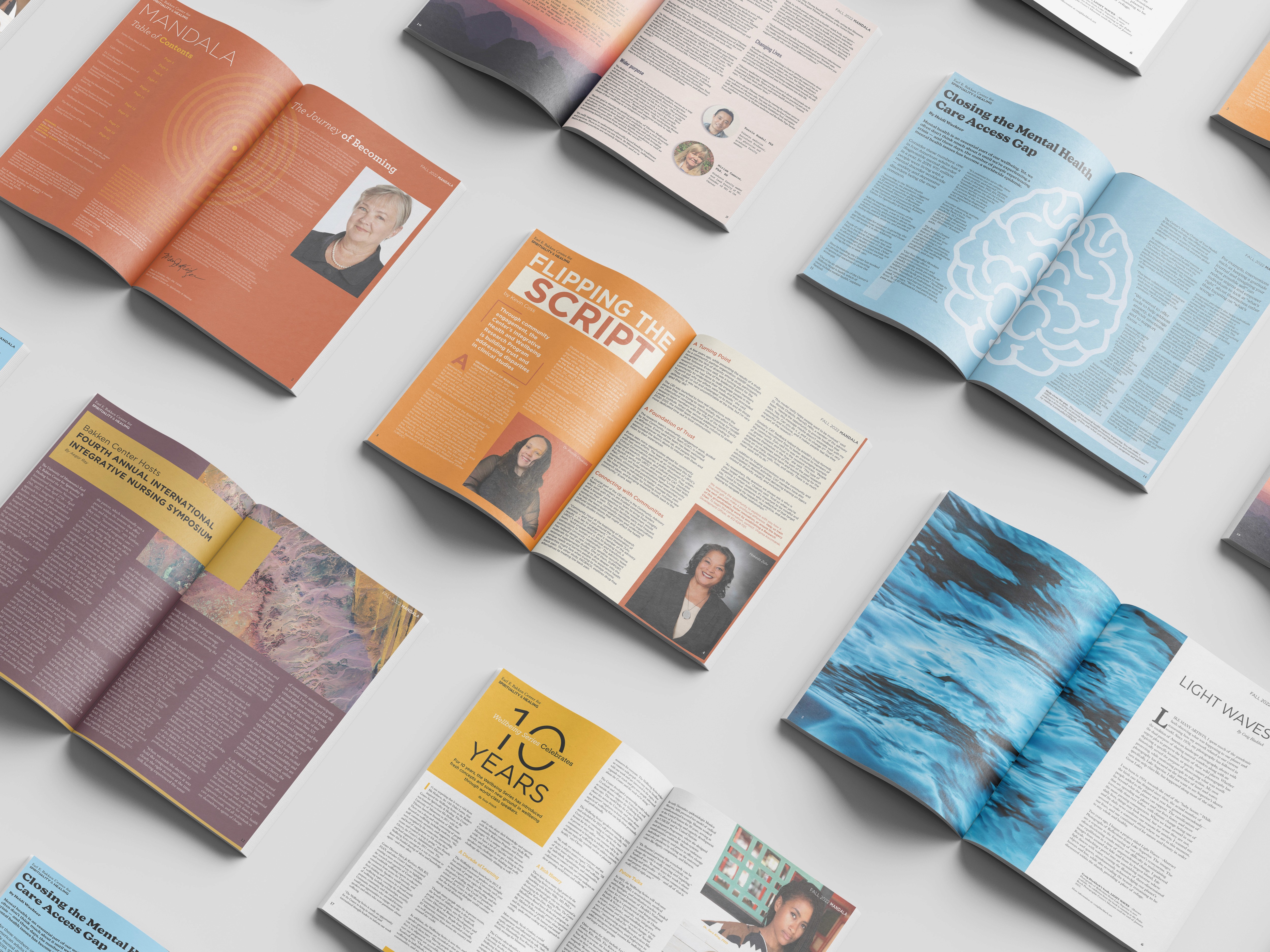
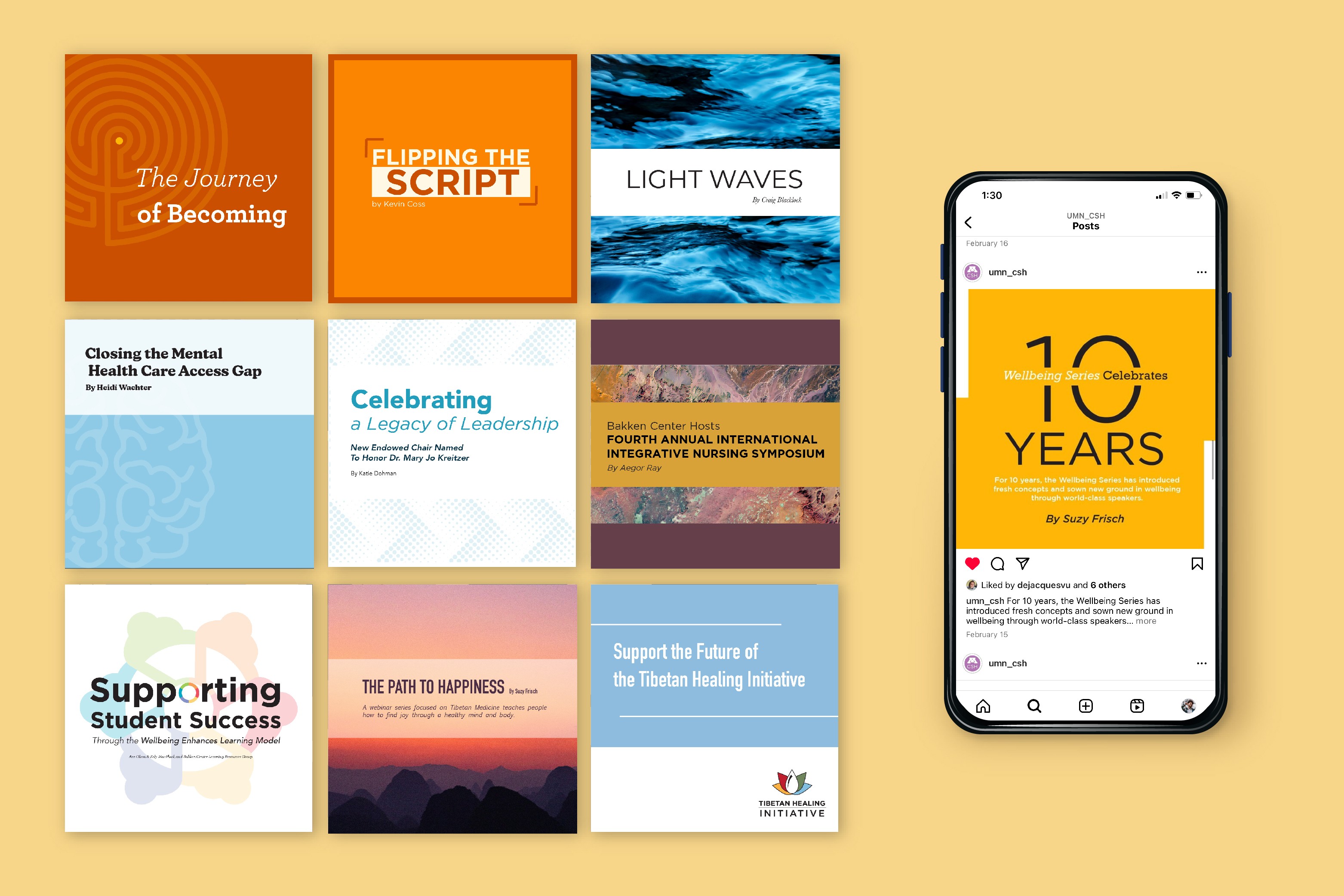
Working within the same framework repeatedly has pushed me to discover new typographic/ layout capabilities in Indesign, and ways to make academic content visually compelling. Working with the student designers has also strengthened my mentorship and communication skills.
Stakeholder feedback has been consistently positive, and while I don't have donation metrics, the magazine continues to serve as a central fundraising tool for the Center.

Next projects.
(2016-25©)