

The Center had no unified brand: inconsistent colors, mismatched fonts, and disconnected materials across programs. The lack of unity made it difficult for the Center's main audiences to look for/attend future programming.
To address this challenge, I developed a flexible design system that gave each of the Center’s three audiences a distinct yet cohesive visual language: illustrative and playful for students, candid and photography-driven for community outreach, and decluttered and textural for health professionals.
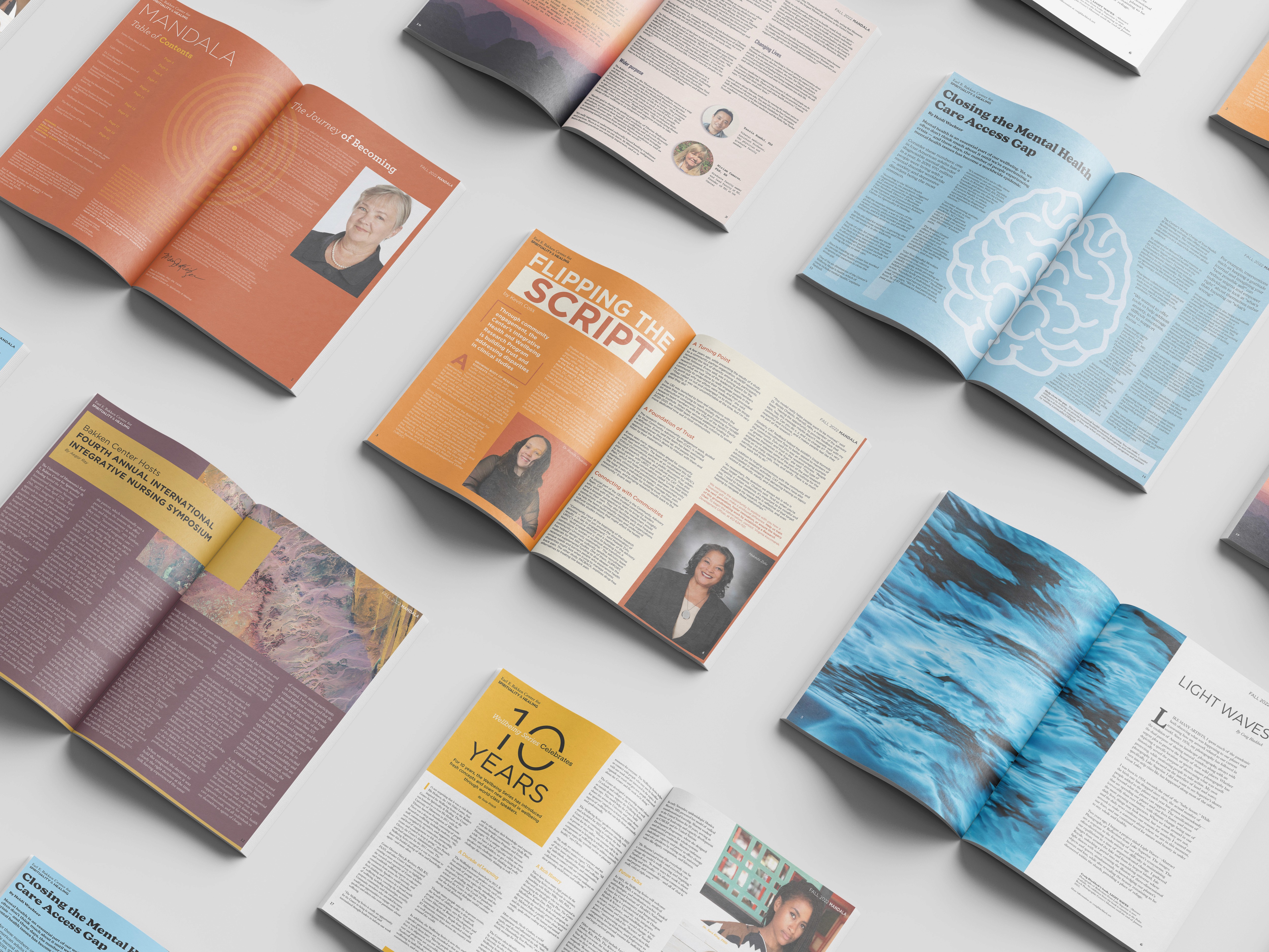


Reception from stakeholders and outreach audiences was strong, and social engagement grew noticeably more consistent.
Beyond the success of the visual system, the experience strengthened my proficiency in digital accessibility while mentoring student designers sharpened my communication and leadership skills.

Next projects.
(2016-25©)